Dashboard
Monitor KPIs, compare forecast vs actuals, and track performance at a glance.
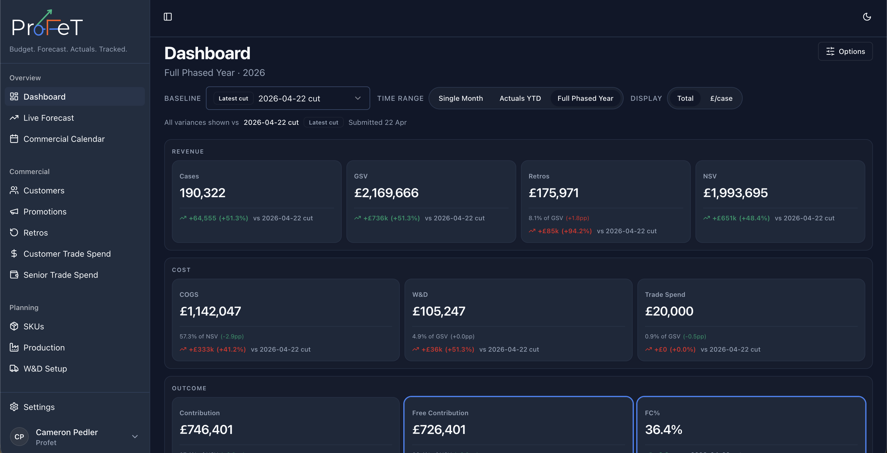
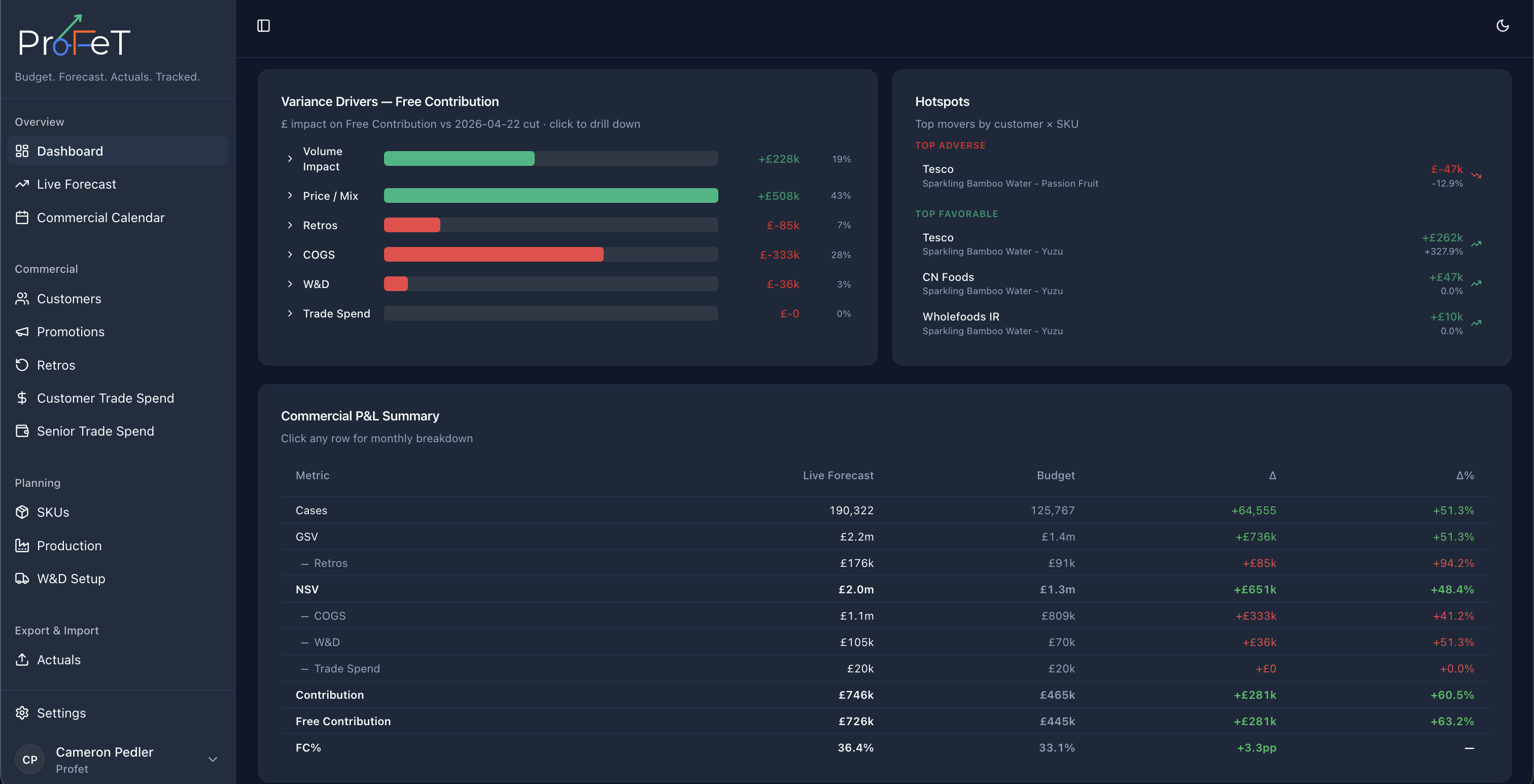
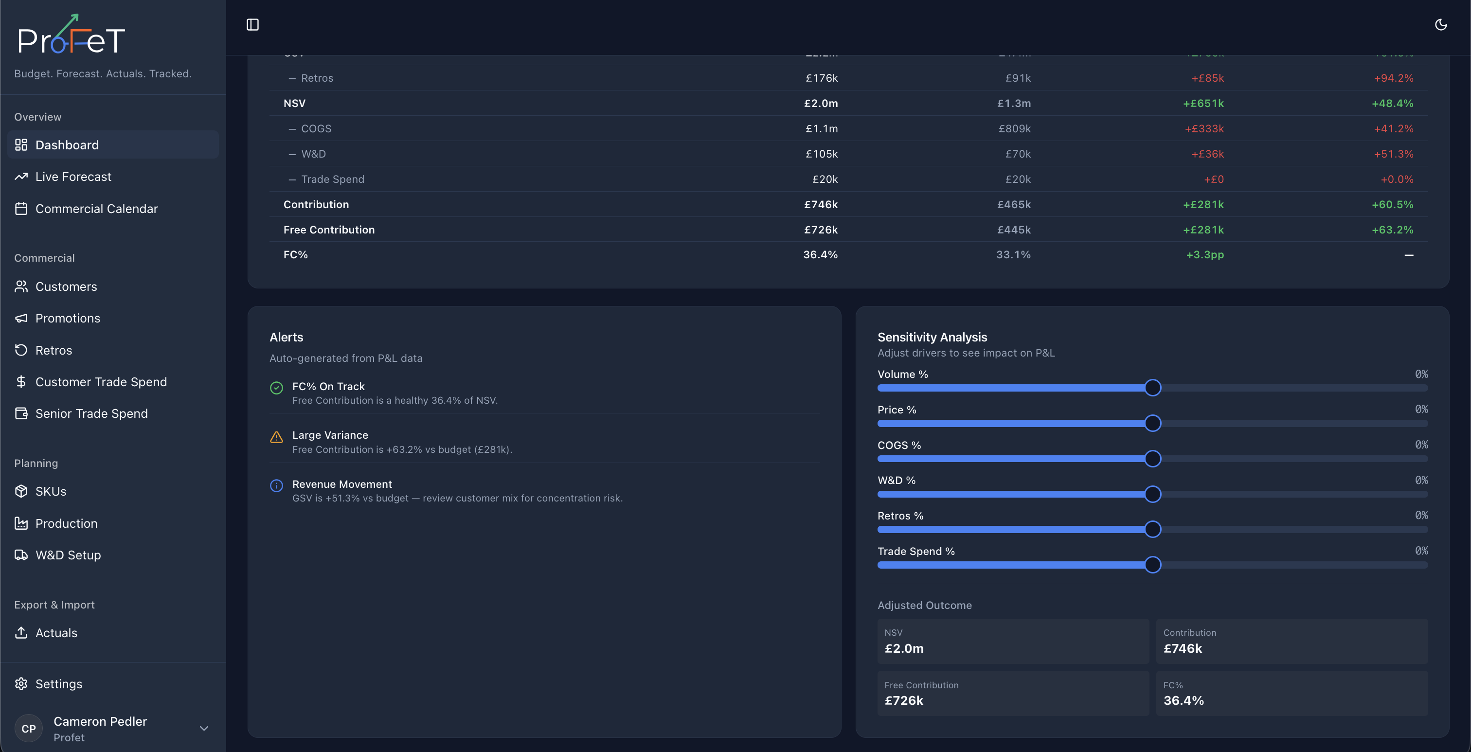
The Dashboard is your performance overview — a single screen showing how your business is tracking against plan.
Metrics
The Dashboard displays key financial and volume metrics as tiles at the top of the page:
| Metric | What It Shows |
|---|---|
| Cases | Total volume (units sold or forecast) |
| GSV | Gross Sales Value — total revenue |
| Retros | Retrospective discounts applied |
| NSV | Net Sales Value (GSV − Retros) |
| COGS | Cost of Goods Sold |
| W&D | Works & Distribution costs |
| Trade Spend | Promotional investment |
| Contribution | Profit after all costs |
| Free Contribution | Contribution before trade spend |
| Free Contribution % | Free Contribution as a percentage of NSV |
Each tile shows the current value plus a delta compared to your chosen baseline — colour-coded green (favourable) or red (unfavourable).
The colour logic is direction-aware: for revenue metrics (GSV, NSV, Contribution), higher is better. For cost metrics (COGS, Retros, W&D), lower is better.
Comparison Modes
Choose what you’re comparing against using the comparison selector:
| Mode | What It Compares |
|---|---|
| Budget vs Forecast | Annual budget snapshot against the current live forecast |
| Forecast vs Actuals | Live forecast against real sales data |
| Budget vs Actuals | Annual budget against real sales data |
You can also select specific snapshots to compare — useful for tracking how your forecast has evolved over time.
Value Modes
Toggle between two views:
- Total — Absolute values (e.g. total GSV in £)
- Per Case — Values divided by volume (e.g. GSV per case)
Per-case mode is useful for spotting mix or pricing changes that wouldn’t be visible in totals.
Filters
Narrow the Dashboard view by:
- Customer — Focus on a single customer or group
- SKU — Filter to specific products
- Date range — Select the time period to analyse
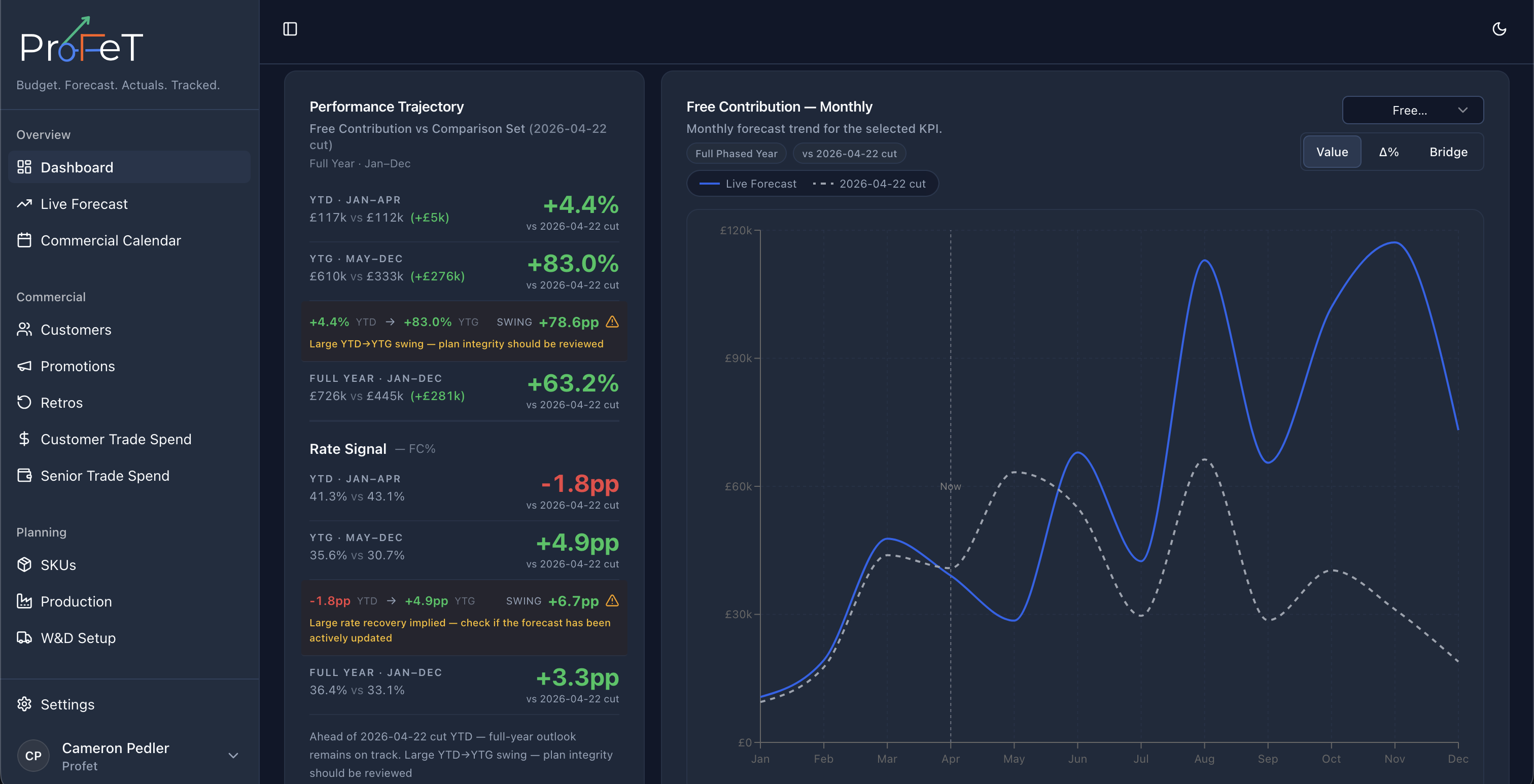
Forecast Chart
Below the tiles, a time-series chart shows weekly case volumes for your live forecast. This gives you a visual sense of demand patterns — seasonality, promotional spikes, and ramp-ups are all visible at a glance.
Calendar Types
The Dashboard respects your tenant’s calendar configuration:
- Gregorian — Standard monthly periods (Jan–Dec)
- 4-4-5 — Retail calendar with 4, 4, and 5-week periods per quarter
- 4-5-4 — Alternative retail calendar pattern
- 5-4-4 — Alternative retail calendar pattern
Calendar type affects how weekly data is aggregated into periods across the platform.
Dashboard Screens